Creative Project - Second Iteration
Contents
Icebreaker (10-15 min)
Start the class with an icebreaker or warm-up game .
Stand-up Meeting (5-10 min)
Just like last time , have each team hold a stand-up meeting. As a reminder, each student should answer the following questions:
- What did I achieve last session that helped us meet our planned goals?
- What will I work on today to help us meet our planned goals?
- What challenges am I facing that may block us from meeting our planned goals?
Once students are comfortable with this format, you might introduce some other questions:
- Do you need anything from anyone here in order to proceed?
- Is this harder/easier than what you thought? Can someone else help?
If you need to adjust your task priorities, do so at the end of the meeting.
Continue prototyping
During the rest of the session, have students work on their planned tasks while also focusing on the look-and-feel of their website. Students will need to communicate effectively with other team members to make sure a consistent design is used throughout the site. All styles should be put in a single
style.css
file, which should be used by every page in the website.
Team Roles
Throughout the course, you might find other students gravitate toward certain roles. You can encourage students to take more ownership in the roles that they feel most comfortable with (just remember to communicate these roles to everyone on the team). For example, some students might gravitate more toward tasks that require more visual and creative thinking. You might encourage those students to take more responsibility with the design of the site by assigning them to a specific role, such as "lead designer".
Some example roles you might consider:
- Designer: oversees the "look and feel")
- Engineer: oversees good coding practices, finds solutions to problems)
- QA/Testing: oversees the usability of the website from an end-user perspective
|
|
TO-DO: Other roles? |
Thinking about color
There's no wrong colors. What's important is how you use them. But with such a broad spectrum, how do you know which colors to use for different parts of your website?
Choose a Palette
Most web designers start by choosing a color palette. Ideally you want colors that work harmoniously with each other and don't clash. The following website is a great tool for choosing a color palette. Simply choose your primary and secondary colors, and you'll get a full palette of colors on the lower right. It will also give you a link to download some CSS code with pre-generated class names that you can use on your elements (you can just copy-and-paste this code into `style.css`.
https://www.materialpalette.com/
Text color
Text is for reading, so make sure your text color is readable against its background. The following is an example of poor choice for text and background color:
For better readability, choose a text color that has sufficient contrast against the background.
Thinking about design
Here are some other useful "best practice" tips in web design:
- Don't be afraid of whitespace. You're not designing a newspaper, so you don't need to cram everything into a small space. Give your elements room to breathe.
- Less is more. When designing websites, there is always the temptation to add “more stuff”. Try to avoid clutter by adding only what is absolutely necessary.
- Maintain consistency. Keep a consistent design throughout your entire site. Make sure your navigation bar looks the same across all pages.
- Use informative page titles
- Have a page footer area that includes contact info, or "website created by ____________"
- Keep a good balance of text/graphics/white space on page
- Make sure you have good contrast between text and background
- Put compelling, interesting information at the top of the homepage
- When using custom fonts, don't use heavily stylized fonts for normal paragraph text. Simple-looking fonts will be easier to read. Use stylized fonts for headings.
Custom fonts
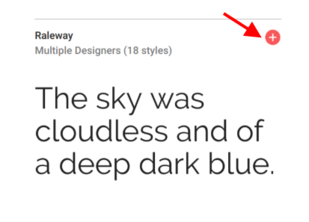
You can use custom fonts in your CSS to give your website a little more personality. Google provides a large number of free fonts at https://fonts.google.com .
To use these fonts, simply select the "+" sign to add the fonts to your selection.
Then, click the bar at the bottom of the screen to reveal instructions on how to use the fonts in your HTML and CSS code.
There's no need to download any fonts. The stylesheet link given to you includes special CSS code to automatically load the font files from Google's servers.
CSS Tricks
Students can refer to the Cool CSS Tricks section of their CSS Reference for more CSS ideas, or they can view a list of snippets from CSS Tricks at https://css-tricks.com/snippets/css/ .
An easy way to test snippets of HTML and CSS are to use CodePen . Simply go to https://codepen.io and click on "New Pen" to enter HTML and CSS code.
Sharing Time (10-20 min)
At the end of each session, have your student teams present their website to other students. This will help give them practice for Demo Day. Encourage students to give feedback, and have someone on the presenting team make notes for the feedback so that they can incorporate changes later on.


