Creative Project - First Iteration
In the last session, we kicked off the Creative Project. In order to give students more creative freedom, the sessions from here on will be "low scaffolding". This means there will be less hand-holding than there was with the guided project. At this stage, students should be getting a feel for how to guide their own learning, and mentors should encourage them to do so. While the guided project focuses on technical skills, the creative project is designed to develop
21st century skills
.
While the creative project sessions are less structured, we still highly encourage planning a session agenda to keep things moving forward. We'll provide recommended agendas for each session, but you're free to customize as needed for your teams.
Contents
Icebreaker (10-15 min)
Start the class with an icebreaker or warm-up game .
Project work plan (if not completed last week)
Now that you have made progress on wireframing your website, it will be important to understand how to approach your project: what steps you need to take first, what deadlines are needed to ensure that you have a functional website for demo day, what your research needs are, and which tasks may take more time and efforts (especially related to your creative project challenges).
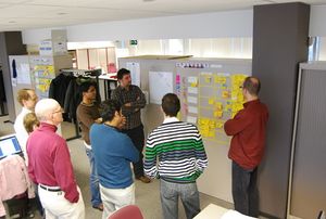
Take the next 15-20 minutes to spend time on your team's project plan. Work with students to help break down their project into requirements written on a sheet of paper. Requirements are basically the features of your website. These should be specific enough that the students will know exactly what to do when working on that item.
For each requirement, have students rate its effort on a "four-star" scale:
| ★ | tiny: can do within a few minutes |
| ★★ | small: can do in around 15-20 minutes |
| ★★★ | medium: can do in under an hour |
| ★★★★ | large: might take a whole session |
Anything larger than four stars should be broken down into smaller pieces.
For bigger groups, you may also need to divide up tasks among team members to ensure that you have a presentable website for demo day.
Once you have a list of tasks, work with students to prioritize the requirements on a new sheet of paper. For example, if a task involves choosing a background image or something "cosmetic", that can be left until the end. For each requirement, you can ask the question "Is this essential in order to demo my website?".
During each session, you can use this list of requirements to keep students focused and on-task.
Students should discuss what content should be completed by the end of each session and outline goals to structure their work (ideally, so that they have a final website by the end the final session).
Stand-up Meeting (5-10 min)
At the beginning of each session, each student team should have a short meeting to review progress, create goals, and discuss challenges. In Agile Software Development , this is called the " Stand-up meeting ". All members are encouraged to stand up during the meeting in order to keep the meeting short.
The structure of a stand-up is simple. Each team member answers the following three questions:
- What did I achieve last session that helped us meet our planned goals?
- What will I work on today to help us meet our planned goals?
- What challenges am I facing that may block us from meeting our planned goals?
Once students are comfortable with this format, you might introduce some other questions:
- Do you need anything from anyone here in order to proceed?
- Is this harder/easier than what you thought? Can someone else help?
If you need to adjust your task priorities, do so at the end of the meeting.
Assign work
Mentors should now help students work as a team to divide up the work. Each student (or pair of students if pair-programming) should work on their own page within the website.
Prototyping: Transition from paper to code (60-90 min)
If students have not completed their wireframes , have them finish up within the next few minutes. Don't spend too much time on paper -- you can always come back to it if you feel the need to.
Set up the team workspace
Have one student on the team create a workspace (aka "repl") and share with the rest of the students on the team (mentors can also create workspaces and share them, if that's easier). See the multiplayer section of the Getting Started with Repl.it handout for instructions.
Each student or pair should now create their HTML file. All filenames should be simple and not include any spaces. The recommended convention is to use all lowercase letters, and dashes instead of spaces. For example: "
about-us.html
" or "
our-products.html
".
|
|
The homepage should always be called
index.html
.
|
Add the basic HTML
Any time you create a new page, start by adding the basic HTML structure, which includes
<html>
,
<head>
, and
<body>
:
<!doctype html>
<html>
  <head>
  </head>
  <body>
  </body>
</html>
Thinking about HTML elements
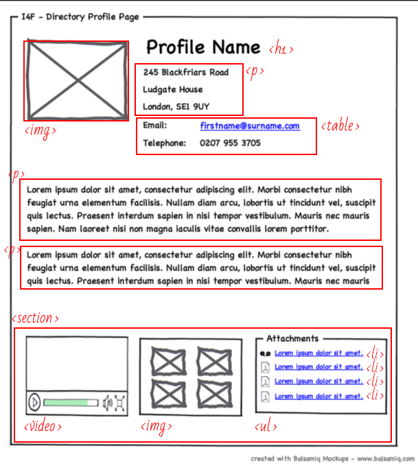
Have students mark on their wireframes what HTML elements they might use for each piece of content. Sometimes it helps to draw boxes around the content to indicate what content an element contains. Try using a colored pencil to visually separate your markings from your wireframe. If students don't want to "mess up" their wireframes, they can copy it to another piece of paper and mark on that. The following is one example of how this might be done:
Add the markup to your code
Once students have thought through what elements to use, have them begin adding those elements to their code. Make sure to pay close attention to elements that are contained inside larger elements and remember to use closing tags in the appropriate place.
Editing CSS
We want the look-and-feel of our website to be somewhat consistent from page-to-page, so the students will need to work together to maintain a single CSS file. So, every HTML page will need to include the following code in its
<head>
section:
<link rel="stylesheet" type="text/css" href="style.css">
Luckily, Repl.it allows simultaneous editing of files, so students at different computers will be able to work on the CSS file at the same time.
Extra time: think about CSS layout
If there's time, students can begin thinking about how they might lay out their pages using CSS. The best tool for this is flexbox. A great guide on using flexbox can be found here: https://css-tricks.com/snippets/css/a-guide-to-flexbox/ . This guide shows properties for a flex container , or parent on the left, and properties for flex items or children on the right.

