Web Dev Client Project: Part 4
Contents
Emphasizing text
Your client has asked you to emphasize their company name anywhere that it's mentioned on the website.
You can emphasize text using
<em>
element.
The
<em>
element is what's known as an
inline
element. Inline elements are different from
block
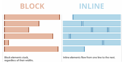
elements. Block elements are always stacked on top of each other, regardless of their widths, while inline elements flow from one line to the next. Other inline elements you've used before include
<a>
, and
<img>
.
You can use the
<em>
element any time you want to add
em
phasis to a word or a phrase, for example:
Find the company name anywhere it's mentioned your code and enclose it within
<em>
and
</em>
tags. When you're done, move onto the next step to see how to change its style.
Styling
Now we need to style our emphasized text. We can style text using a number of CSS properties. Look on your CSS Cheat Sheet under Text Properties to see the different ways you can style text.
By default, the browser will style
<em>
text as italic. But we don't necessarily need it to be italic, we want it to be bold and a different color. You can override the browser's default styling by setting any of those properties to a different value. In our case, we don't want italic, so we set "font-style" to "normal" in our CSS code
Now, we can add
font-weight
and
color
properties to style the emphasized text whichever way we want.
Getting help from the internet
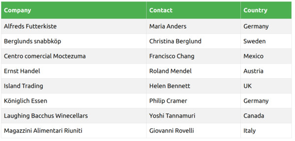
Your customer has asked for the following style changes to your table:
- Give the table a border
- The table cells should be spaced out a little more.
- Every cell should have a 1-pixel thin border around it.
- Make the heading row a dark background color, and the text white
That may seem like a lot of changes that we might not know how to do yet. Luckily, there are a lot of useful sites on the internet that can help us out, for example:
- Google , a popular search engine.
- Stack Overflow is a site where you can ask any question, and other coders will help you out.
- Mozilla Developer Network (MDN) (from the makers of Firefox) has a vast library of up-to-date reference guides for HTML, CSS, and JavaScript.
- W3 Schools has great tutorials to help with common web development tasks
- CSS Tricks , as the name implies, has some excellent tips and tricks that are easy to apply to your own CSS code.
Style your table
The following article from W3 Schools will show you how to style tables using CSS. Use the information from this article to style table like your customer has requested:
View Article : W3 Schools: CSS Tables
Add the new "Contact Us" page
Create a new .html page just like you have before. A really easy way to do this is to copy-and-paste an existing page and remov everything inside the
<body>
element.
Add your heading using an
<h1>
element.
As you can see, the client wants two sections side-by-side. You've done something similar on your home page. Look at the code from your homepage to see how you can do the same thing. The steps are:
-
Add a
<div>element to act as a container for both sections, and give it a class name. -
Add 2
<section>elements inside the container. -
Within each section, place the appropriate
<h2>heading -
In the "contact info" section, use 3
<p>elements. One for the name, one for the email, and one for the location address. In the address, put a line break (<br>) after the street name, so that the street name is on one line, and the city, state, and zip are on the next. -
For the email address, use a mailto: hyperlink, like so:
<a href=" mailto:whatever@example.com ">whatever@example.com</a>. This will open the user's email program when clicked. - In the next step, we'll add the map under the "Our Location" heading.
Adding a map from Google
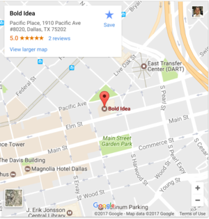
Adding an interactive map is actually really easy because Google has done most of the difficult coding for us. All we have to do is use a "snippet" of code to have a fully-functional Google map right on our website.
- Click here to go to the Google Maps embed API page (you can switch tabs to come back here and look at the instructions).
- Type the address in the box under "Highlight a place or address.
- The map to the right shows a preview of how it will look on your page. Click the “Looks good” button when you're ready.
- Then, highlight the text below next to API KEY and copy-and-paste it into the box on the Google page where it says "Enter your API key" (make sure there are no space before and after).
-
Finally, copy-and-paste the generated
<iframe>HTML element into your section on your page where the map should go.
API KEY:
AIzaSyCema48hs-LMIJCk_VZUQE994IsVQOidA8
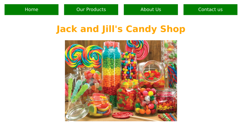
Almost every website has a navigation menu. Without it, users don't know where to find information on your website. The navigation menu works kind of like a menu at a restaurant. It gives you a quick glance of everything that's available without giving you too many details. On websites, navigation menus are just a collection of hyperlinks (
<a>
elements) that are often styled to be user-friendly.
The above image shows an example navigation menu. This common style of menu is what's known as a "navigation bar", since the menu items form a horizontal bar at the top of the page.
Click next to see how to make this type of menu on your own website.
On your home page (
index.html
), put a
<nav>
element at the very top of your page, just under your opening
<body>
tag. This element serves as a container for our navigation item, and tells the browser that we're putting inside here is specifically intended for navigation.
Inside your
<nav>
element, add hyperlinks for each page using
<a>
elements.
Below is an example -- you'll need to adjust the links to match your site:
  <nav>
    <a href="index.html">Home</a>
    <a href="products.html">Our Products</a>
    <a href="about-us.html">About Us</a>
    <a href="contact-us.html">Contact us</a>
  </nav>
|
|
Refer to your CSS Cheat Sheet if you have trouble remembering how to write CSS code |
In your
styles.css
file, create an empty CSS rule for the
<nav>
container using the selector:
nav
. Then, create another empty CSS rule for all
<a>
elements inside the
<nav>
using the selector:
nav a
.
Now, make the
<nav>
element act like a flexbox container by setting its
display
property to
flex
in the CSS rule. This will make the links appear side-by-side.
Next, let's make the links look more like buttons:
-
Add some
marginandpadding(10pxis always a good start, but experiment to see what looks best to you). -
Set the
background-colorproperty to a darker color (use your CSS colors cheat sheet ), and set the text color to white using thecolorproperty. -
Set the
text-decorationproperty tononeto remove the underline. -
Set the
text-alignproperty tocenterto make sure the text always stays centered within the button.
Try different flexbox techniques
Your nav menu is already looking good. Experiment with some of the following flexbox techniques to change the look and feel to something you like:
-
To make all buttons centered, set the
justify-contentproperty in your nav rule tocenter. -
To have equal spacing between each item, try setting
justify-contentto eitherspace-betweenorspace-around. Can you tell the difference betweenspace-betweenandspace-around? -
To make each button take up as much horizontal space as possible, on your
nav a
css rule, set the
flexproperty to1(the justify-content property mentioned above has no effect when using this).
Congratulations, you're a web developer!
In the coming weeks, you'll be working as part of a team of coders to plan and build your own website. We'll show you some more tricks and techniques to take your web dev skills to the next level!
In the meantime...
Tell us your story
Every coder has a story, and we want to hear yours! Click the button below to fill out our questionnaire:


