AppLab:Layout
The Screen
Adding Elements to the Screen
To add an element to your screen, first Make sure you're in
design mode
(click the
![]() button to switch between code and design modes). Then, drag the element you want from the toolbox onto the app area. Don't forget to
give it an ID
!
button to switch between code and design modes). Then, drag the element you want from the toolbox onto the app area. Don't forget to
give it an ID
!
Screen Coordinates
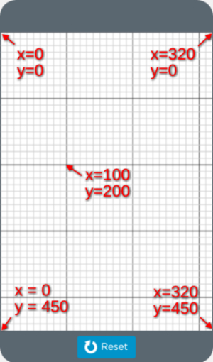
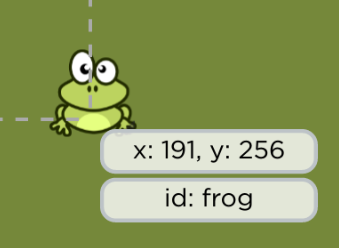
When you move the mouse cursor around in the app area, you'll see crosshairs that tell you the X and Y coordinates of your cursor. Every element on the screen has x/y coordinates, which comes in handy when positioning elements.
Try moving your mouse to the very top-left corner of your screen. If you look at the coordinates, you'll see that X and Y are both 0 (or close to it). If you move your mouse to the bottom-right corner, you'll see that X is 320 and Y is 450. That's because the screen is 320 pixels wide and 450 pixels tall.
Elements are always placed with their upper-left corner at the coordinates. For example, if you have a 100-pixel tall image placed at y=100, its bottom edge will be at y=200.
Using Multiple Screens
Your app can have multiple screens. For example, if you're making a game, you could have an intro screen, a game screen, and maybe a "win" or "lose" screen that shows the final score.
Your screens are listed in the dropdown at the top of the app area (note: you must be in design mode to see this). You can create a new screen by selecting "New screen...", or by dragging a screen element from the toolbox.
Using Elements
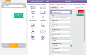
Elements are parts of the user interface , like buttons, labels, images, etc. When you click on an element in design mode, you'll see the properties panel, which will allow you to change different options for your element. For example, many elements have "width" and "height" properties, and some elements have properties that allow you to change the color.
Meaningful ID's
Every element has a property called "id" (which stands for identifier ). You'll use this ID when writing code. For example, if you want to make a button that responds to a click, you'll need to refer to that button in your code using its id.
Layering and Deleting
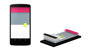
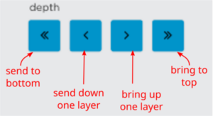
When you add elements to the screen that overlap, they are "layered" on top each other, much like how you'd stack cards in a deck. Adding a new element puts it on the top layer, which is like drawing a card and adding it to the top of the deck. App Lab allows you to send elements backward toward the bottom layer or bring elements forward toward the top layer:
Elements Reference
Label
A label helps the user to identify elements shown on screen, or communicate some kind of message. To change the text of the label, select the element and change the "text" property under the Properties tab. You can also change the color, size, and alignment of the text.
Button
A button allows the user to select input values and to control the flow of the program.
To change the label on the button (ie. what the button says), under Properties in your Workspace, find "text" which is located under "id" and change the default text to show what you wish to display. You can change other properties such as background color, text color, and font color by changing the values in the Properties area.
To execute code when the user clicks the button, you'll need to make an event handler . Events add interactivity to your app / program. For more information on events and event handling, see the section on Events .
Image
To add an image, select and drag the Image element over to the screen. Then, change the image property under the Properties tab by clicking "Choose...", then "Upload File". You can also click on "Icons", which has a large set of icons that are useful in mobile apps.
You can move and re-size the image as needed. Events can also be triggered by clicking on the image in the app.
Text Input
A text input element allows the user to enter lines of text into the app / program. The "placeholder" property can be used to display some text that shows before the user clicks inside the input box.
Text Area
A text area is just like a text input, but bigger. This is useful for allowing the user to type in more text, like a description of something.
Dropdown
Dropdown boxes allow the user to select input from a pre-determined number of choices. To change the values of what is shown in the dropbox, go to "Properties" and find "options". Here you can edit the contents of the dropdown box.
Again, do not forget to give your element a proper "id".
Radio Button
Radio buttons are icons that represent one of a set of options, only one of which can be selected at any given time. Drag and drop each individual radio button over onto the app screen. For each radio button drag a corresponding Label next to the button to give each radio button the value that you desire. Re-sizing and re-positioning of the radio button can be accomplished by placing the mouse on the corner of the button and dragging it to the desired size and position with the mouse.
IMPORTANT
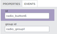
- Together, the radio buttons will have the same "group id" but each individual radio button will have a separate and distinct "id".
Events can be triggered when selecting each of the radio buttons.
Checkbox
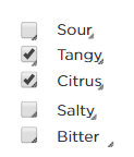
A checkbox permits the user to click on the items that apply. Checkboxes are frequently used when more than one option needs to be selected.
Slider
The slider can be used to enter a numerical value without having to type a number. Using a finger or a mouse, the user can slide the scale left or slide right to assign a value.
Chart
A chart can depict data graphically in your app. Dragging the chart icon onto the app screen will display an area that looks like this:
You can re-size or move the chart where you wish to place it in the screen.
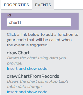
Once this is in place, you can enter code that will generate your chart by going to the "Events" tab and selecting "drawChart" to insert code or "drawChartFromRecords" to generate the chart from data stored in AppLab's table format.
Canvas
The canvas element allows the user to draw graphics on the fly by using a script. You must use a script to actually draw the graphics. The canvas element has several ways to draw paths, boxes, circles, text, and adding images.
